-
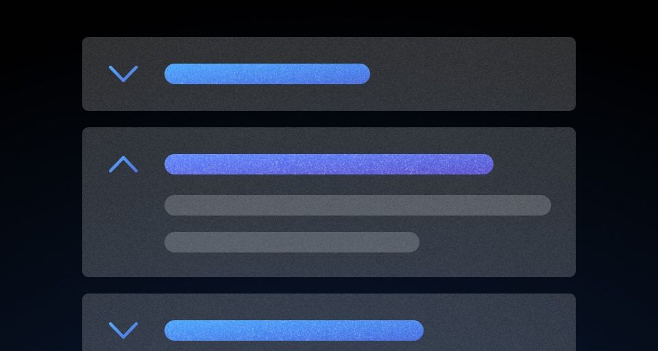
Accordion
A list of toggles that reveal or hide associated content.
-
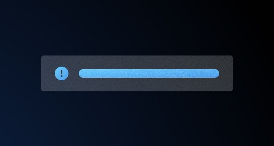
Alert
Displays a brief message without interrupting a user’s task.
-
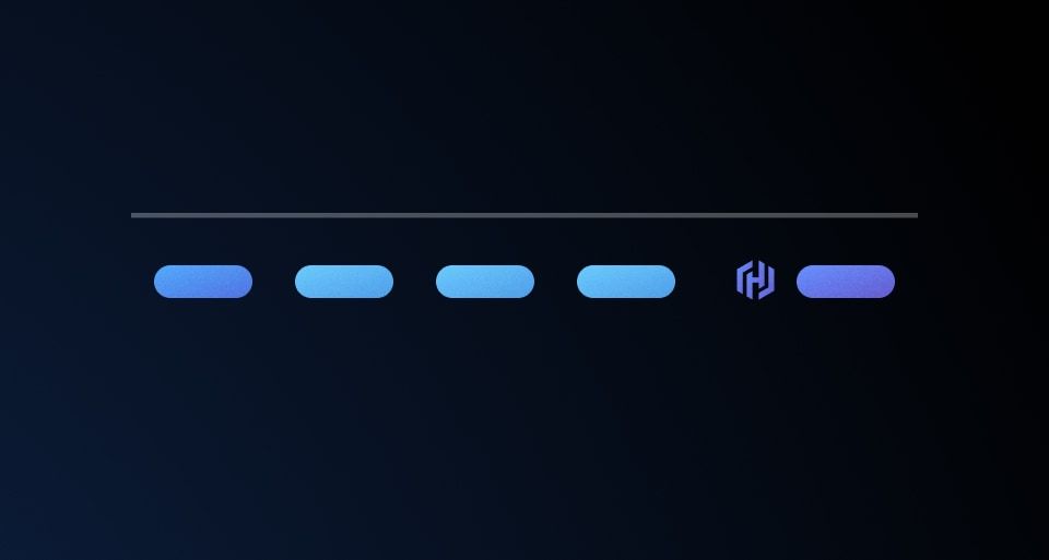
App Footer
Displays supplementary information and links for the application.
-
Application State
An informational element that displays the current state of the application.
-

Badge
Concise, non-interactive labels that represent metadata.
-

Badge Count
A non-interactive numeric label.
-

Breadcrumb
A secondary navigation that shows the user’s current location.
-
Button
An interactive element that initiates an action.
-
Button Set
A set of buttons.
-

Card
A block container that provides styling for elevation, border, and background.
-
Code Block
UpdatedA container for formatting chunks of code with syntax highlighting.
-
Copy Button
A button that copies the attached or associated text upon interaction.
-

Copy Snippet
A button that copies the text content of the button itself.
-
Dropdown
UpdatedHide/Show a list of actions or options with a toggle button.
-

Flyout
UpdatedDisplays additional details and information about an item or object, overlaid on the main page content.
-
Primitives
Elements used to compose form fields.
-

Checkbox
A form element that allows users to select one or more items from a group of items.
-
File Input
A form input that enables users to upload files.
-
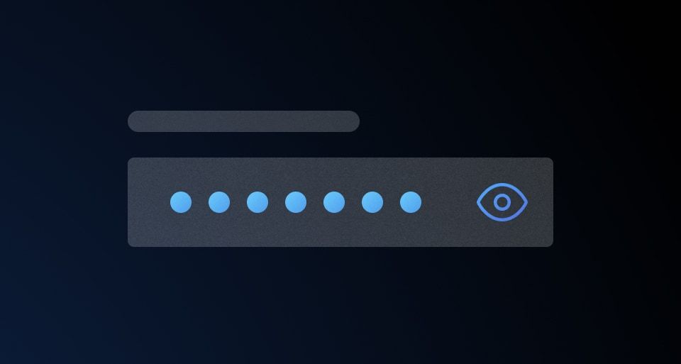
Masked Input
UpdatedA form input that obfuscates sensitive information.
-

Radio
A form element that allows users to select a single item from group of items.
-
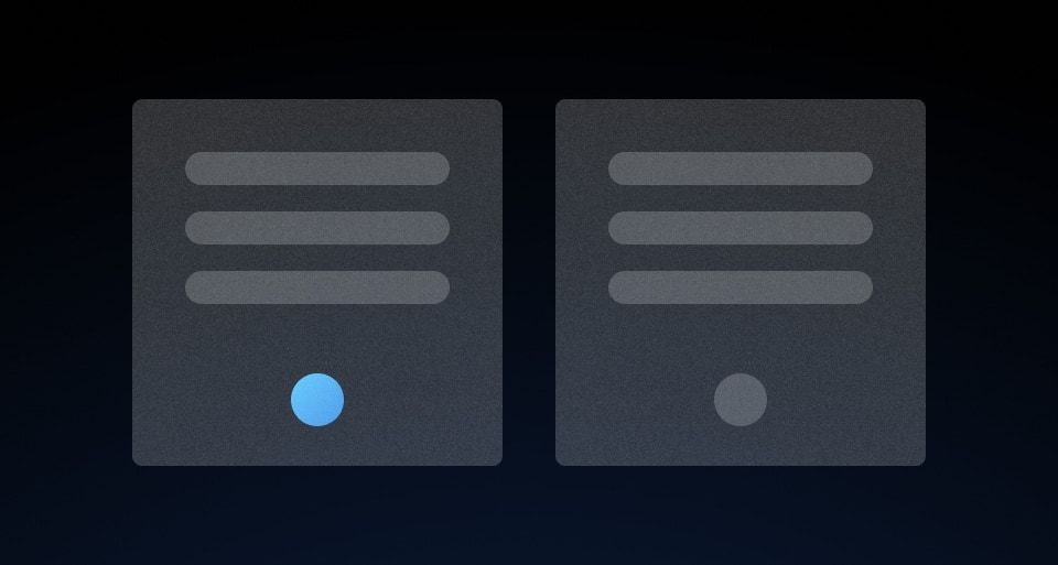
Radio Card
A type of radio input represented as a card.
-
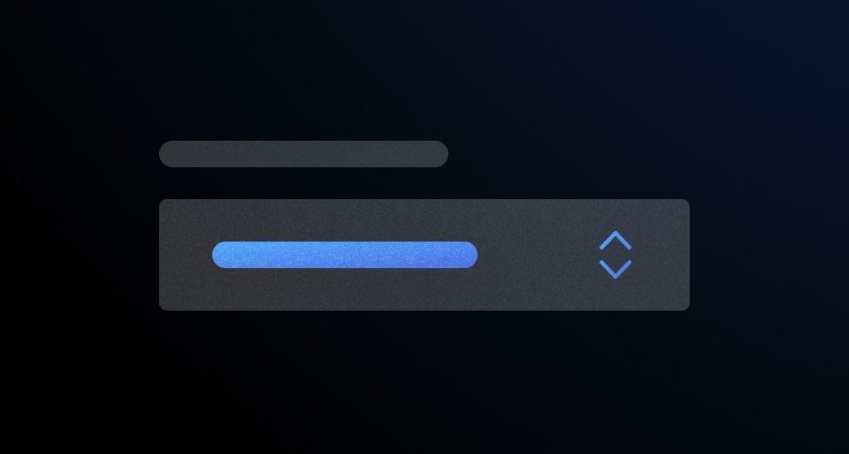
Select
A form element that allows users to choose one option from a list.
-
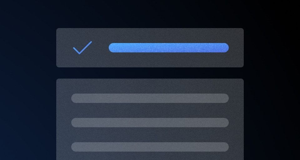
Super Select
UpdatedEnhanced selection component that enables users to search and select items from a list.
-
Text Input
A form element that provides users with a way to read, input, or edit data.
-
Textarea
A form input that accepts multi-line text.
-
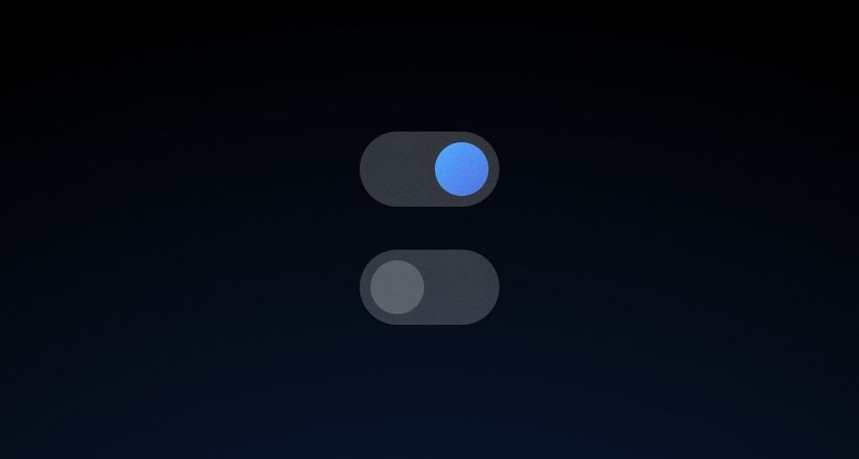
Toggle
A form element that allows users to select between two mutually exclusive states.
-

Icon
AddedUsed to display an icon.
-

Icon Tile
Used to display an icon in a tile-like object.
-
Inline Link
A link used within a body of text.
-

Standalone Link
A link used in isolation and not as a part of surrounding body text.
-

Modal
UpdatedA pop-up window used to request information, confirm a decision, or provide additional context.
-
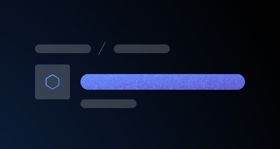
Page Header
Displays the title of the page, metadata, and page-level actions.
-
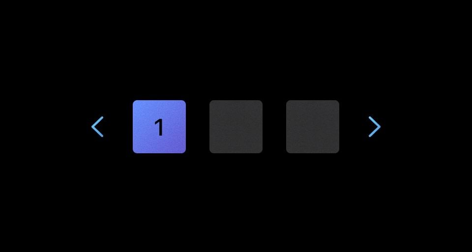
Pagination
Used to let users navigate through content broken down into pages.
-

Reveal
A toggle that reveals additional content to the user when triggered.
-

Rich Tooltip
Provides additional structured informational content for a UI element.
-
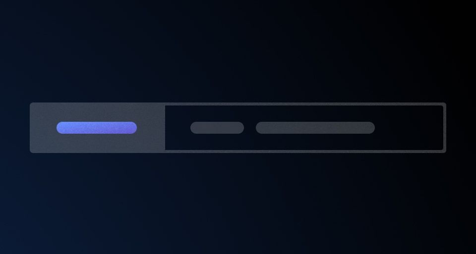
Segmented Group
Combines one or more input fields and actions to handle complex filtering and data collection.
-

Separator
Creates visual breaks between different sections of content
-

Side Nav
A side navigation menu that provides access to subpages within a product or application.
-
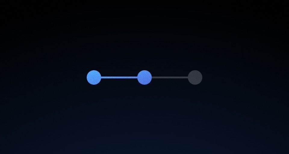
Stepper Indicator
Helps the user maintain context and directionality when advancing through a multi-step flow or feature.
-
Advanced Table
AddedUsed to display organized, two-dimensional tabular data.
-

Table
UpdatedUsed to display organized, two-dimensional tabular data.
-
Tabs
Allows users to move among different views within the same context.
-
Tag
Used to indicate an object’s categorization.
-
Text
A component that applies predefined typographic styles to its content.
-

Time
AddedDisplays dates and times in a consistent format.
-

Toast
Used to display messages that are the result of a user’s actions.
-

Tooltip
Provides additional information or context for a UI element.
Layouts
Overrides
Utilities
-
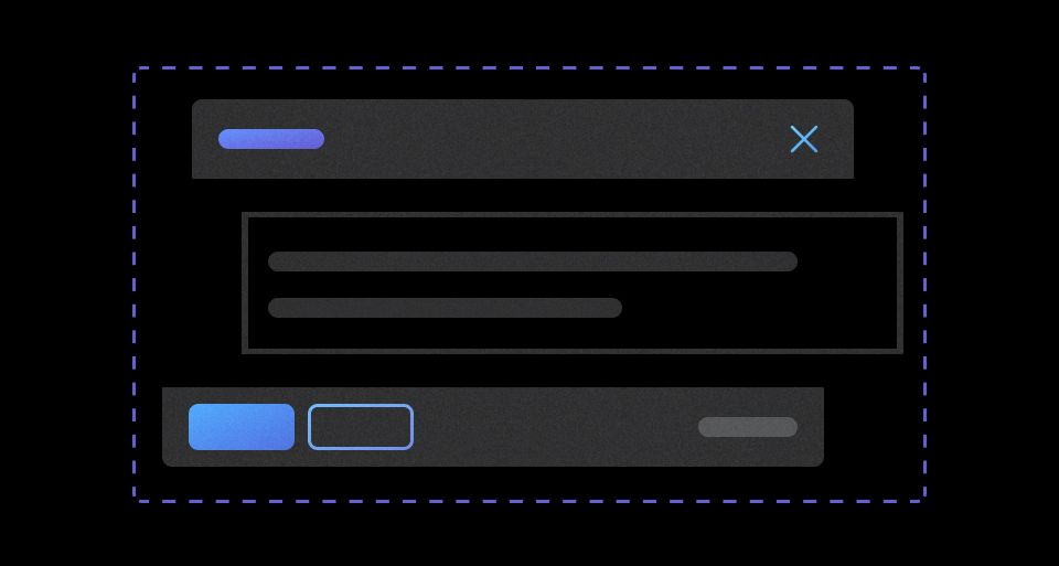
DialogPrimitive
UpdatedThe foundational blocks of dialog components.
-

DisclosurePrimitive
An internal utility component that provides show/hide functionality.
-
Dismiss Button
An internal utility component used to provide "dismiss" functionality in other components.
-

Interactive
An internal utility component used to provide interactivity to other components.
-
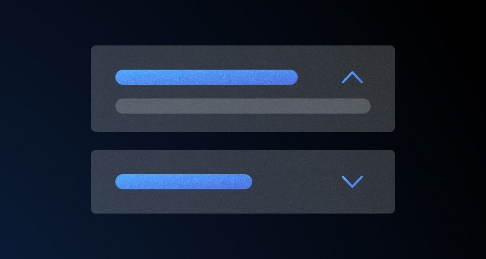
MenuPrimitive
DeprecatedAn internal utility component that provides show/hide functionality.
-
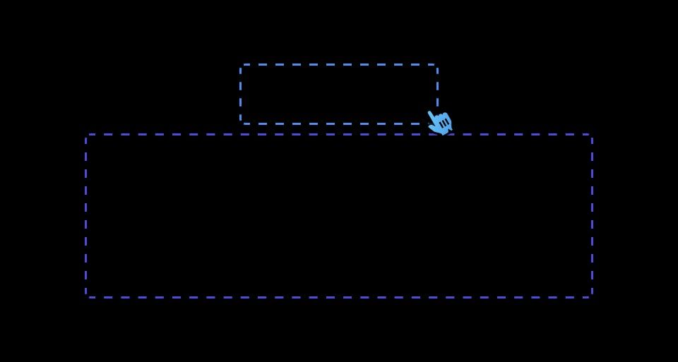
PopoverPrimitive
An internal utility component that provides popover, anchoring, and collision detection functionalities.
